A great way to capture a Zelda game’s essence is to depict one of its more memorable moments or themes in a work of art. What do you think of when you see A Link Between Worlds? For me, I think of the unique art style and Link walking on walls. And The Minish Cap? I imagine Link walking amongst towering blades of grass and acorns.
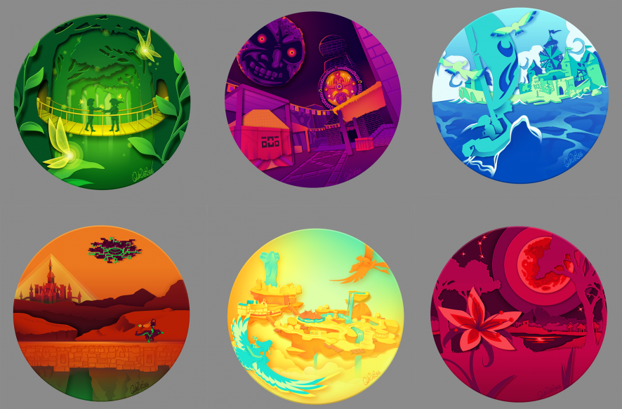
Quotedotlass, a user on Reddit, managed to capture the essences of many games while creating their collection of Zelda-themed buttons.
To get started, let’s take it back to the ’90s with a bit of Nintendo 64 action.

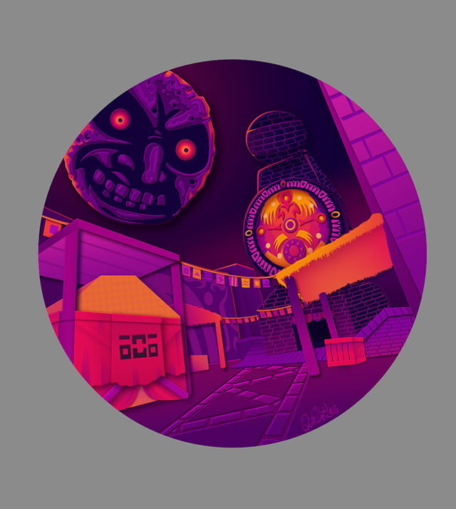
These two definitely give off different vibes, just as their respective games do, and they might just be my favorites out of the collection. The use of colors in both is great, too. Ocarina of Time uses shades of green and yellow for that “forest-y” feel and a bit of childlike innocence as Link sets off for his grand journey. Meanwhile, Majora’s Mask uses dark shades of purple for that sense of doom and gloom. Both pieces capture the feel of the game perfectly.
Up next would be the GameCube era, with The Wind Waker and Twilight Princess.
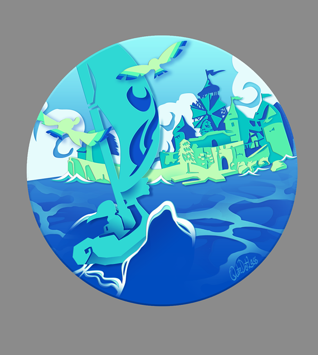

Again, the colors capture the essence of each game perfectly. The Wind Waker‘s blues give off the feeling of being by the ocean, while the orange of Twilight Princess makes it feel like dusk, or twilight (See what I did there?), is consuming the land.
Remember when I said that the art pieces for the Nintendo 64 games might be my favorites? Scratch that. Twilight Princess definitely takes the cake. There might be a little bias here, seeing as it is my favorite game of the series, but the piece brings back memories of running through Hyrule Field and finding the architectural marvel that is the Bridge of Eldin. I thought it was such a cool area with how you could cross it to explore more of Hyrule, have that battle against King Bulblin, and be able to jump off into the water below for quick transport to Lake Hylia.
Finally, we’re moving to the new-school era. Or sort of new. While these next two games weren’t on the same console when they originally released, you can now play them both on the Switch.
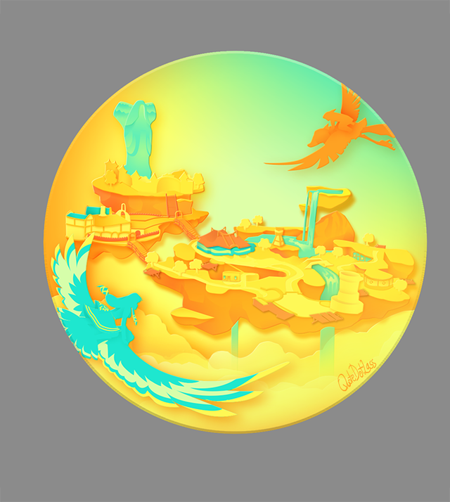
Skyward Sword always gave that sense of freedom with the open skies. With Link and Zelda being at the forefront of the game, the button does a good job of showing what Skyward Sword is all about. It’s also a nice touch to give the Goddess Statue and Zelda similar colors!
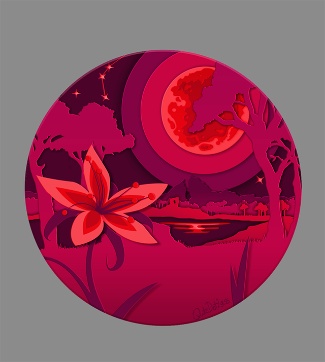
Last, we have Breath of the Wild. This was the button that caught my eye first. I think having the Silent Princess in the foreground, followed by the path that most players will probably take on their first playthrough to get to Kakariko Village, is excellent. It creates a sort of nostalgic feeling seeing the Dueling Peaks. It’s all tied together with the Blood Moon to remind you that Calamity Ganon still has his grip on Hyrule.
All of these buttons bring back memories of playing through the Zelda series and capture memorable moments in their own ways. For me, the Twilight Princess button made me want to pick up my Wii Remote and start the game again (for what’s probably the 15th time, at this point). The best part about this set is that it’s a set. We get to see art based on six different games to scratch different itches and remind us why we love each game.
Quotedotlass creates content over on Reddit, including more art themed around Zelda, click their username to see more!